JS——背景色的滑动效果以及输入框的状态切换效果实现
提示:文章写完后,目录可以自动生成,如何生成可参考右边的帮助文档
前言
在之前的文章中有分享过利用HTML+CSS制作静态页面(例如前文的阿里矢量图标库官网的实现),但之前的实现过程并未涉及JS的内容,今天实现了几个小功能,其中运用到了之前所讲的知识点,在这里一并分享给大家吧~
一、输入框的状态切换以及鼠标点击下拉框的出现
1.成果图
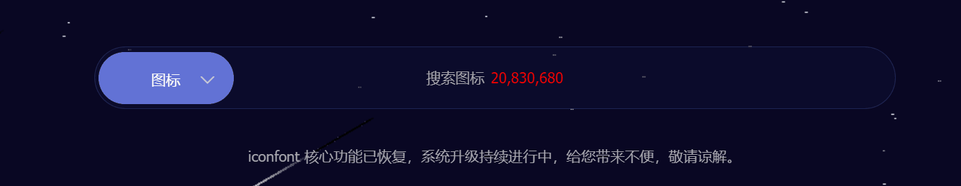
2.需求解析
- 蓝色区域的效果实现——如上图所示,当用户点击蓝色区域时,下拉框呈现对应的打开或关闭状态,当鼠标点击其他区域时,该区域也会呈现关闭状态,那么如何实现呢?
- 解决方法:在书写结构时,可将蓝色区域设置为input框 type类型选为button(具体实现过程见下文)随后利用输入框的获取/失去焦点事件进行控制。
- 输入框的效果实现—— 可利用输入框的获取/失去焦点事件实现。
3.实现过程
HTML 结构
<!-- 搜索框 -->
<div class="search-total-box">
<input type="button" class="search-upbox" value="图标">
<i class="iconfont arrow-down"></i>
<!-- 下拉框 -->
<div class="search-downbox">
图标
</div>
</input>
<div class="word">搜索图标<b>20,830,680</b></div>
<input type="text" id="input">
</div>CSS样式
.search-total-box {
    width: 760px;
    height: 58px;
    line-height: 58px;
    text-align: center;
    margin: 0 auto;
    border: 1px solid rgba(34, 43, 95, .79);
    background: rgba(14, 16, 52, .5);
    border-radius: 40px;
    padding: 0 4px;
    position: relative;
    transition: all .4s;
}

.search-total-box:hover {
    border-color: #6974b3;
}

.search-upbox {
    background: #6272D6;
    width: 130px;
    height: 50px;
    line-height: 50px;
    margin-top: 3px;
    border-radius: 45px;
    border: 1px solid transparent;
    text-align: center;
    font-size: 14px;
    color: #ffffff;
    position: relative;
    left: -316px;
    top: 1px;
    outline:none;
}

.arrow-down{
    position: absolute;
    left: 100px;
    top: 2px;
    font-size: 14px;
    color: #ccc;
    transition: transform .3s, top .3s;
}

.search-downbox {
    position: absolute;
    width: 120px;
    height: 50px;
    line-height: 50px;
    box-shadow: 0 0 4px 0 #6973b3;
    border-radius: 6px 6px 4px 4px;
    background-color: #090723;
    top: 60px;
    left: 10px;
    display: none;
    color: #ffffff;
    font-size: 14px;
}

.search-total-box>#input {
    width: 590px;
    height: 44px;
    position: absolute;
    top: 7px;
    right: 28px;
    outline: none;
    background: transparent;
    border: none;
    color: #fff;
    font-size: 18px !important;
}

.search-total-box .word {
    margin-top: -58px;
    font-size: 14px;
    color: #a6a5ad;
}

.search-total-box .word>b {
    padding-left: 6px;
    color: #ff0200;
    font-weight: 400;
}
JS行为
// 设置图标按钮单击下拉框出现
// 获取按钮
let upbox = document.getElementsByClassName("search-upbox")[0];
let downbox = document.getElementsByClassName("search-downbox")[0];
let arrow = document.getElementsByClassName("arrow-down")[0];

//  设置点击事件,为upbox设置鼠标监听事件,当鼠标点击时,设置相关效果
upbox.addEventListener(
  "click",
  function () {
    if (downbox.style.display == "block") {
      downbox.style.display = "none";
      arrow.style.transform = "rotate(0deg)";
    } else {
      downbox.style.display = "block";
      arrow.style.transform = "rotate(180deg)";
    }
  },
  false
);

upbox.onblur = function () {
  downbox.style.display = "none";
  arrow.style.transform = "rotate(0deg)";
};

// 当输入框获取焦点时,预留文字消失
// 获取输入框和预留文字部分
var input = document.getElementById('input');
var word  = document.getElementsByClassName('word')[0];
input.onfocus = function( ){
  word.style.display = 'none';
}
input.onblur  = function( ){
  word.style.display = 'block';
}
二、背景色的滑动效果
1.成果图
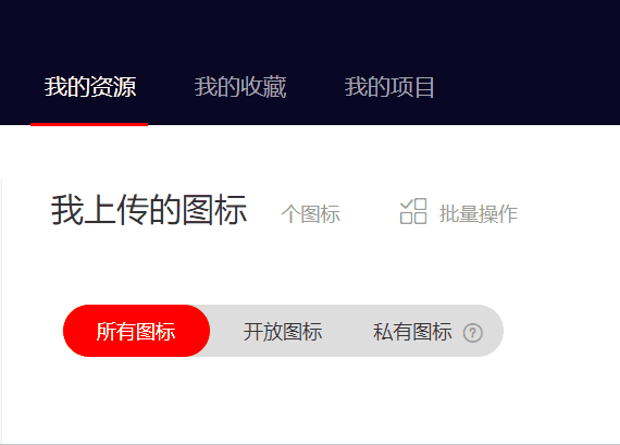
2.解析
- 当用户点击某元素时,相应的背景色以及如上图所示的红色底线也应该做相应的调整。
- 这就要利用到鼠标的点击事件并控制该元素滑动的距离并结合全文所讲的变形的知识点即可实现该功能
3.实现过程
3.1红色背景区域实现过程
HTML结构
<div class="box" id="red-box">
<ul>
<li>所有图标</li>
<li>开放图标</li>
<li>私有图标<i class="iconfont why"></i></li>
</ul>
<!-- 红色背景滑块 -->
<div id="cover"></div>
</div>CSS样式
.box {
    width: 964px;
    height: 33px;
    margin: 12px 0px 20px;
}

.box>ul {
    width: 270px;
    height: 32px;
    background: #ddd;
    border-radius: 40px;
    display: inline-block;
    vertical-align: middle;
    position: relative;
}

.box>ul>li {
    float: left;
    width: 90px;
    height: 32px;
    line-height: 32px;
    text-align: center;
    position: relative;
    z-index: 2;
    font-size: 12px;
    color: #333;
    cursor: pointer;
    transition: color .2s ease-in-out;
}
.box>ul>li:first-child{
    color: #fff;
}
#cover {
    position: relative;
    left: 0;
    top:-32px;
    width: 90px;
    height: 32px;
    background-color: #ff0000;
    z-index: 1;
    border-radius: 17px;
    cursor: auto;
    transition: left .1s ease-in-out;
}

.why {
    margin-left: 5px;
    color: #999;
    font-size: 30px;
    font-weight: bold;
    vertical-align: middle;
}
// 我的资源区域点击切换效果实现
// 获取每一个li
var active0 = document.querySelectorAll('.project-left li')[0];
var active1 = document.querySelectorAll('.project-left li')[1];
var active2 = document.querySelectorAll('.project-left li')[2];
// 获取底部红色的线条
var line = document.getElementById('red-line');
// 为每一个 li 绑定单击事件
active0.onclick = function( ){
active0.className = 'my-source';
line.style.left = '35px';
}
active1.onclick = function( ){
active1.className = 'my-source';
line.style.left = '130px';
}
active2.onclick = function( ){
active2.className = 'my-source';
line.style.left = '219px';
}3.2我的资源下方滑动条
HTML结构
 <!-- 项目与资源区域 -->
                        <div class="project-left">
                            <ul>
                                <li class="my-source">
                                    <a href="#">我的资源</a>
                                </li>
                                <li  class="my-source">
                                    <a href="#">我的收藏</a>
                                </li>
                                <li  class="my-source">
                                    <a href="#">我的项目</a>
                                </li>
                            </ul>
                            <!-- 底部红色线条 -->
                           <span id="red-line"></span>
                        </div>
CSS样式
.project-left {
    width: 276px;
    height: 50px;
    position: relative;
}

.project-left li {
    float: left;
    width: 56px;
    height: 50px;
    line-height: 50px;
    padding: 0 8px;
    text-align: center;
    margin-right: 20px;
}

.project-left li:hover a {
    color: #fff;
}

#red-line {
    width: 72px;
    height: 2px;
    background: red;
    display: block;
    z-index: 10;
    transition: width .1s ease-in-out;
    position: absolute;
    bottom: -1px;
    left: 35px;
    transform: translate(-50%, 0);
}

.project-left li:first-child a {
    color: #fff;
}

.project-left li>a {
    font-size: 14px;
    color: #a6a5ad;
}
JS行为
// 红色图标的背景色切换效果

// 获取红色图标下的所有子元素
let list0 = document.querySelectorAll("#red-box li")[0];
let list1 = document.querySelectorAll("#red-box li")[1];
let list2 = document.querySelectorAll("#red-box li")[2];

// 获取红色滑块
let cover = document.getElementById("cover");

// 获取问号小图标
let why = document.getElementsByClassName('why')[0];
console.log(why);
// 为每一个li添加点击事件
list0.onclick = function () {
  cover.style.left = "0";
  list0.style.color = "#fff";
  list1.style.color = "#333";
  list2.style.color = "#333";
  why.style.color = '#999';
};
list1.onclick = function () {
  cover.style.left = "90px";
  list1.style.color = "#fff";
  list0.style.color = "#333";
  list2.style.color = "#333";
  why.style.color = '#999';
};
list2.onclick = function () {
  cover.style.left = "180px";
  list2.style.color = "#fff";
  list0.style.color = "#333";
  list1.style.color = "#333";
  why.style.color = '#fff';
};
总结
ok,写到这里今天的分享也就到此结束啦,今天天气很好,本人很开心,如果你看到这里也记得要笑一笑哦,最后诚挚祝福屏幕前的你健康幸福、平安喜乐。
版权声明:本文为Bonsoir777原创文章,遵循 CC 4.0 BY-SA 版权协议,转载请附上原文出处链接和本声明。